# 多列等高布局
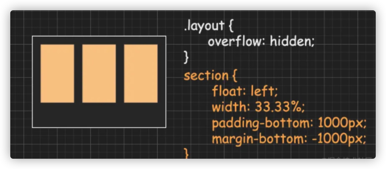
# 方法一:padding + 负margin
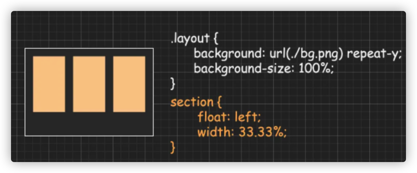
# 方法二:设置父级背景图片
<div class="layout">
  <h4>padding + 负margin</h4>
  <main>
    <section class="padmar green">
      <p>111</p>
    </section>
    <section class="padmar orange">
      <p>222</p>
      <p>222</p>
      <p>222</p>
      <p>222</p>
    </section>
    <section class="padmar blue">
      <p>333</p>
      <p>333</p>
    </sectoin>
  </main>
  <h4>background</h4>
  <main class="bg">
    <section class="green">
      <p>111</p>
    </section>
    <section class="orange">
      <p>222</p>
      <p>222</p>
      <p>222</p>
      <p>222</p>
    </section>
    <section class="blue">
      <p>333</p>
      <p>333</p>
    </sectoin>
  </main>
</div>
.layout {
  width: 700px;
  margin: 0 auto;
}
h4 {
  position: relative;
}
h4::before {
  content: '#';
  display: block;
  position: absolute;
  left: -20px;
  top: 0;
  color: #4ea25d;
  font-size: 18px;
}
main {
  overflow: hidden;
}
section {
  float: left;
  width: 33.33%;
  color: #fff;
}
.padmar {
  padding-bottom: 1000px;
  margin-bottom: -1000px;
}
.green {
  background-color: #41ab3e;
}
p {
  margin: 0;
}
.orange {
  background-color: orange;
}
.blue {
  background-color: #4ba0d8;
}
.bg {
  background: url(https://bubuzou.oss-cn-shenzhen.aliyuncs.com/blog/202102/line_bg.png) repeat-y;
  background-size: 700px 1px;
}
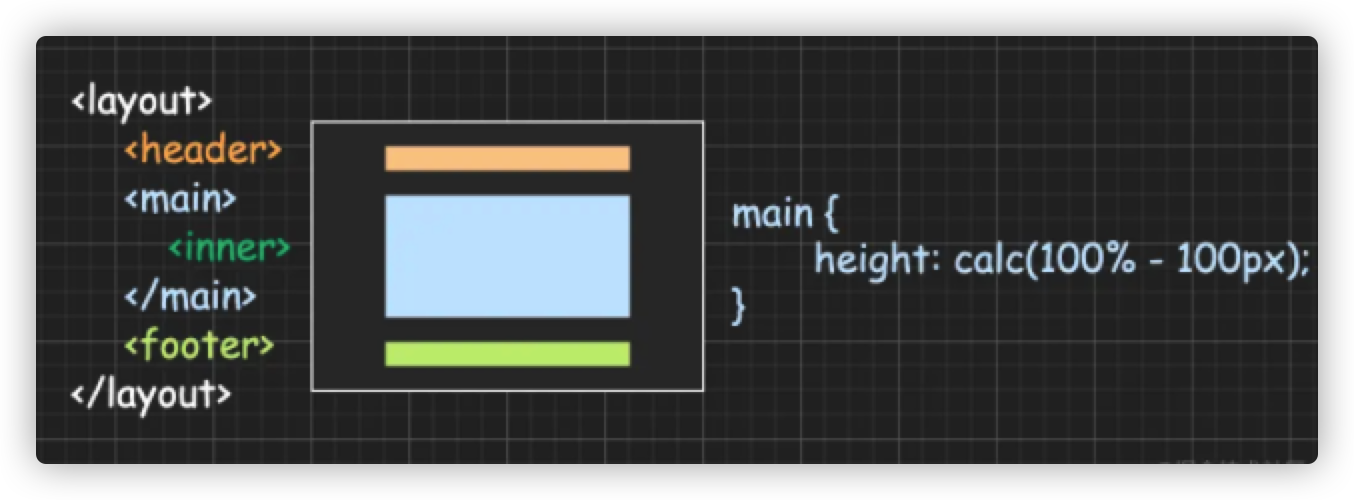
# 三行布局(头尾定高主栏自适应)
<div class="layout">
    <header></header>
    <main>
        <div class="inner"></div>
    </main>
    <footer></footer>
</div>
html,
body,
.layout {
    height: 100%;
}
body {
    margin: 0;
}
header,
footer {
    height: 50px;
}
main {
    overflow-y: auto;
}
# 方法一:calc
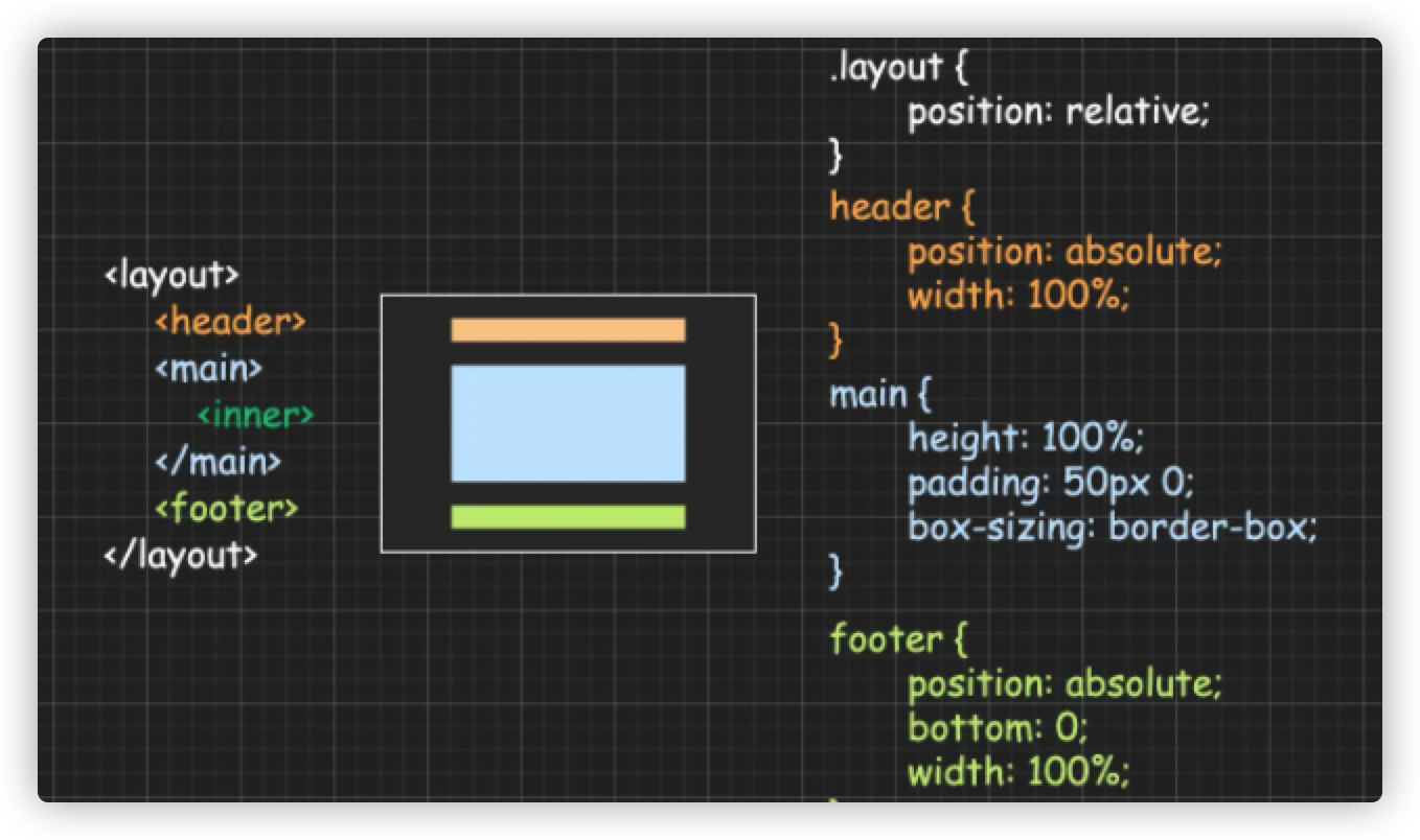
# 方法二:absolute
# 方法三:flex

# 方法四:grid

<div class="layout">
  <section class="demo1">
    <header class="h50 orange">方法一:calc</header>
    <main><div class="blue h400">main</div></main>
    <footer class="h50 black">footer</footer>
  </section>
  <section class="demo2">
    <header class="h50 orange">方法二:absolute</header>
    <main><div class="blue h400">main</div></main>
    <footer class="h50 black">footer</footer>
  </section>
  <section class="flex">
    <header class="h50 orange">方法三:flex</header>
    <main><div class="blue h400">main</div></main>
    <footer class="black h50">footer</footer>
  </section>
  <section class="grid">
    <header class="orange">方法四:grid</header>
    <main><div class="blue h400">main</div></main>
    <footer class="black">footer</footer>
  </section>
</div>
html,
body,
.layout {
  height: 100%;
}
body {
  margin: 0;
}
.layout {
  color: #fff;
  text-align: center;
  display: flex;
  justify-content: space-around;
}
main {
  overflow-y: auto;
}
section {
  width: 20%;
  margin: 20px 0;
}
.h50 {
  height: 50px;
  line-height: 50px;
}
.orange {
  background-color: orange;
}
.blue {
  background-color: #31aff9;
}
.black {
  background-color: black;
}
.demo1 main {
  height: calc(100% - 100px);
    overflow: auto;
}
.h400 {
  height: 400px;
}
.demo2 {
  position: relative;
}
.demo2 header {
  position: absolute;
  left: 0;
  top: 0;
}
.demo2 header {
  width: 100%;
  position: absolute;
  left: 0;
  top: 0;
}
.demo2 main {
  height: 100%;
  padding: 50px 0;
  box-sizing: border-box;
}
.demo2 footer {
  width: 100%;
  position: absolute;
  left: 0;
  bottom: 0;
}
.flex {
  display: flex;
  flex-direction: column;
}
.flex main {
  flex: 1;
}
.grid {
     display: grid;
     grid-template-rows: 50px 1fr 50px;
}
.grid header {
  line-height: 50px;
}
.grid footer {
  line-height: 50px;
}